Victron Energy: a toolkit for installers on-site, under pressure

A toolkit for installers: on-site, under pressure

Client + context

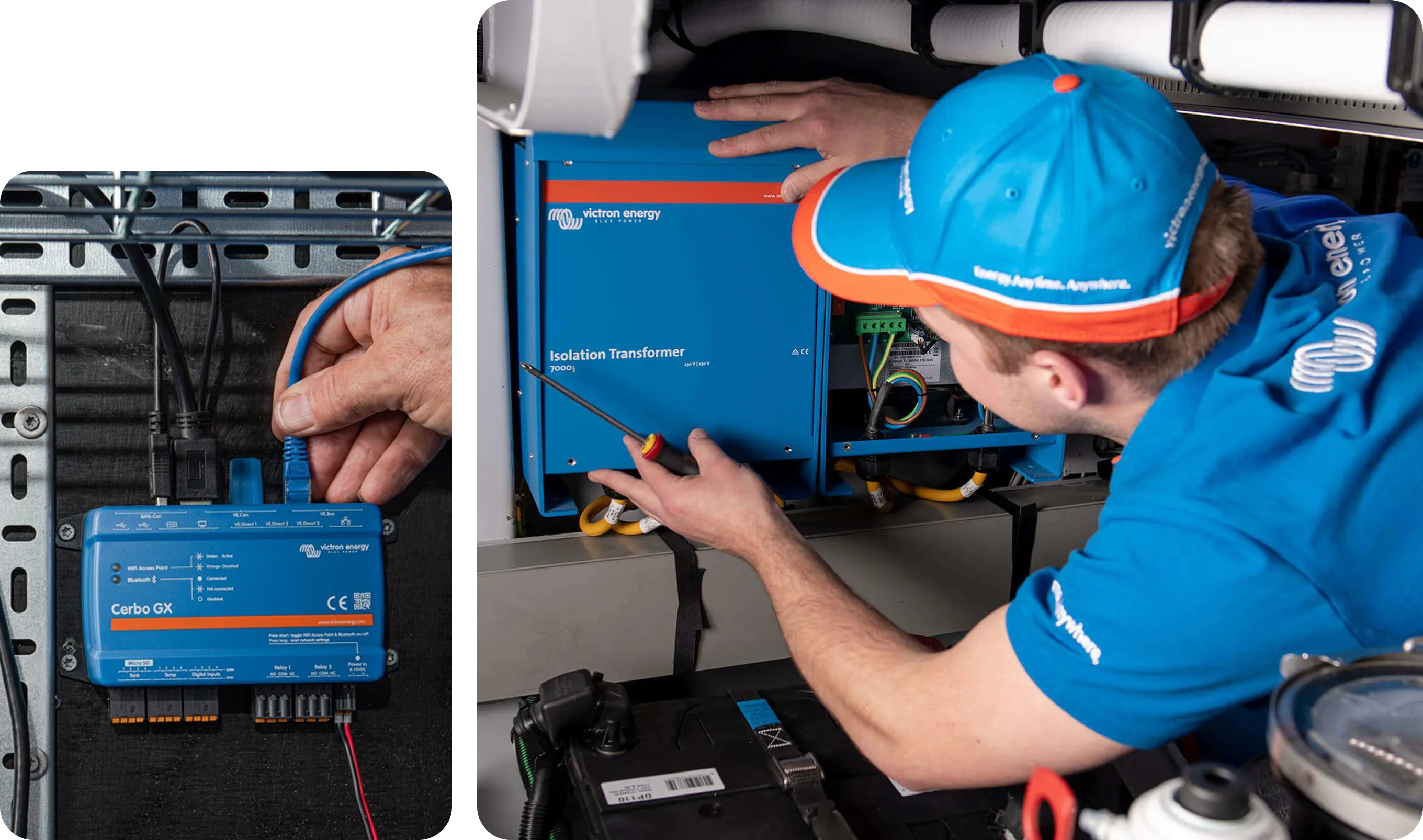
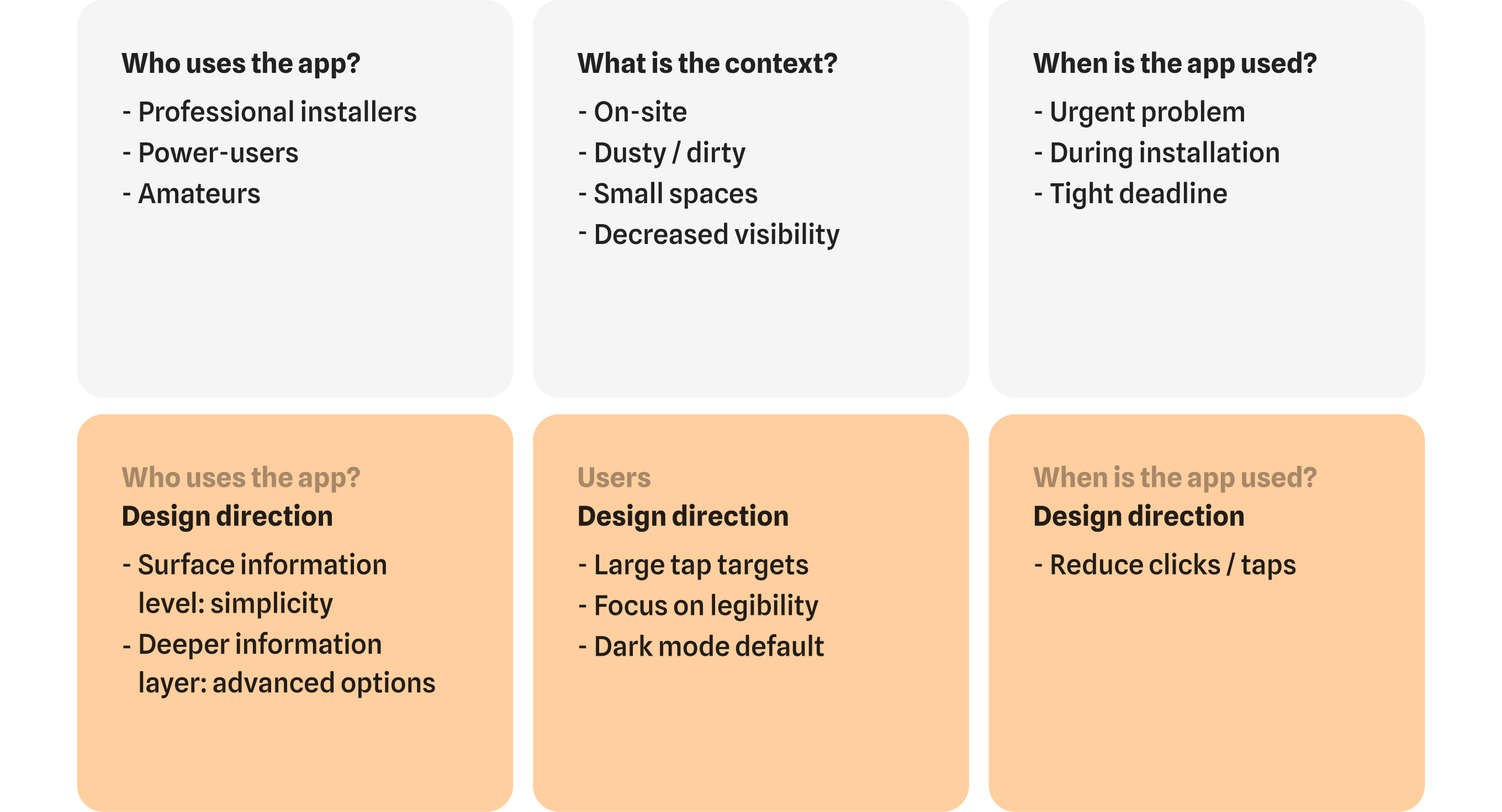
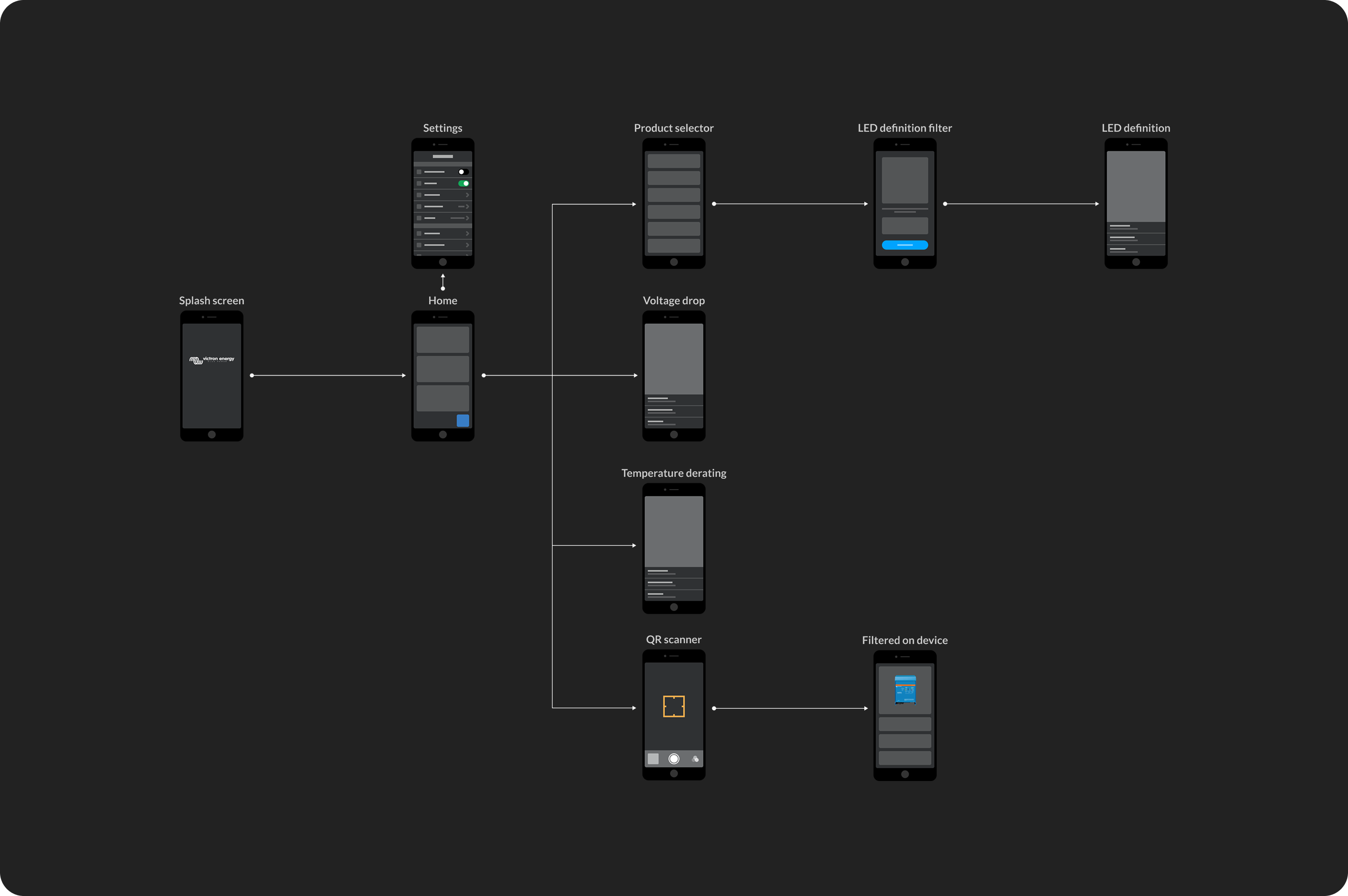
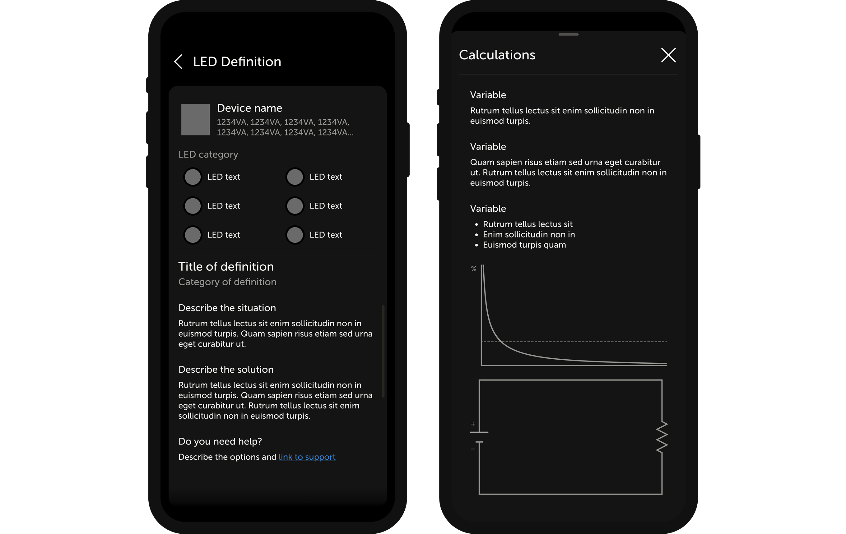
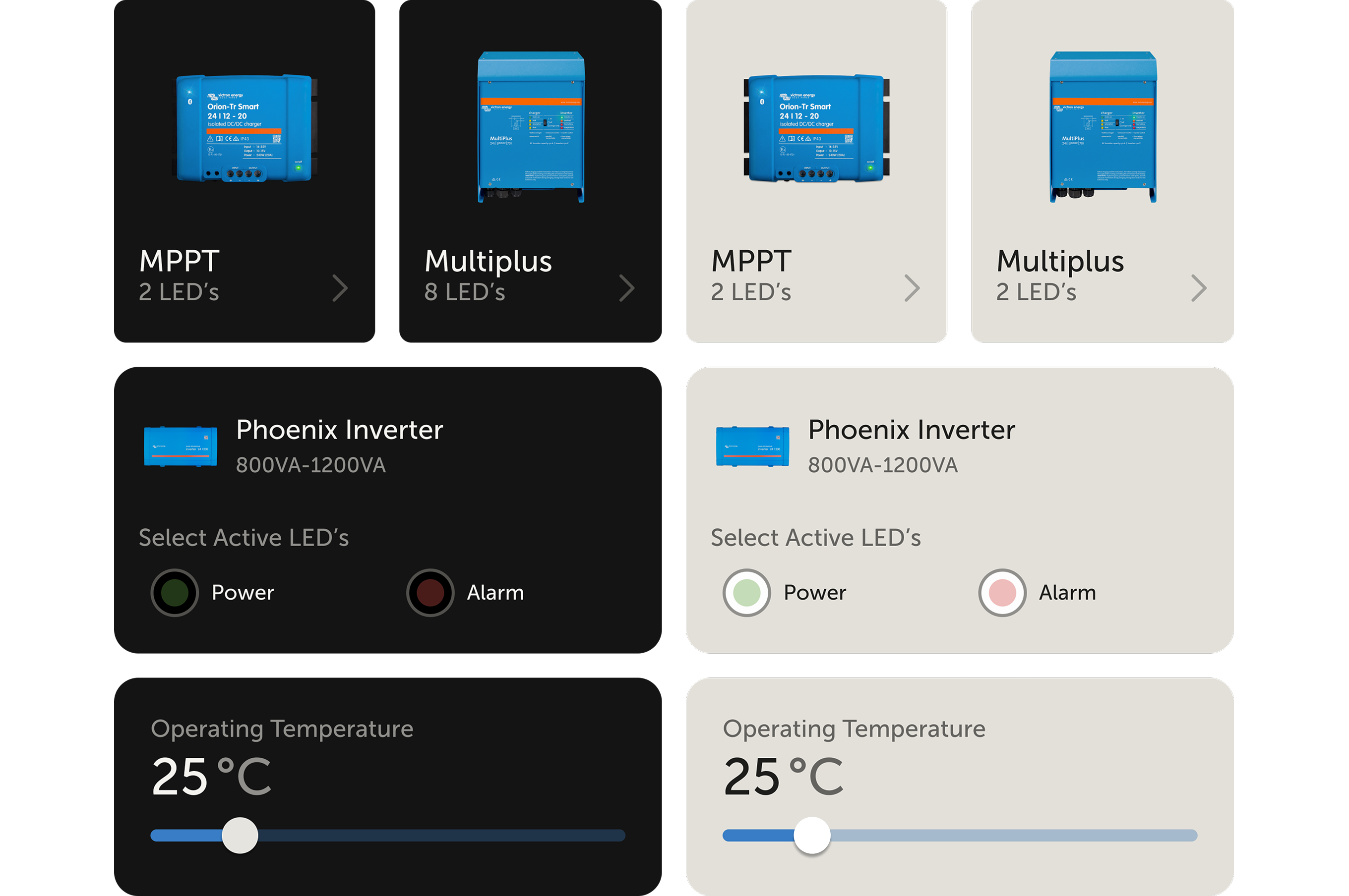
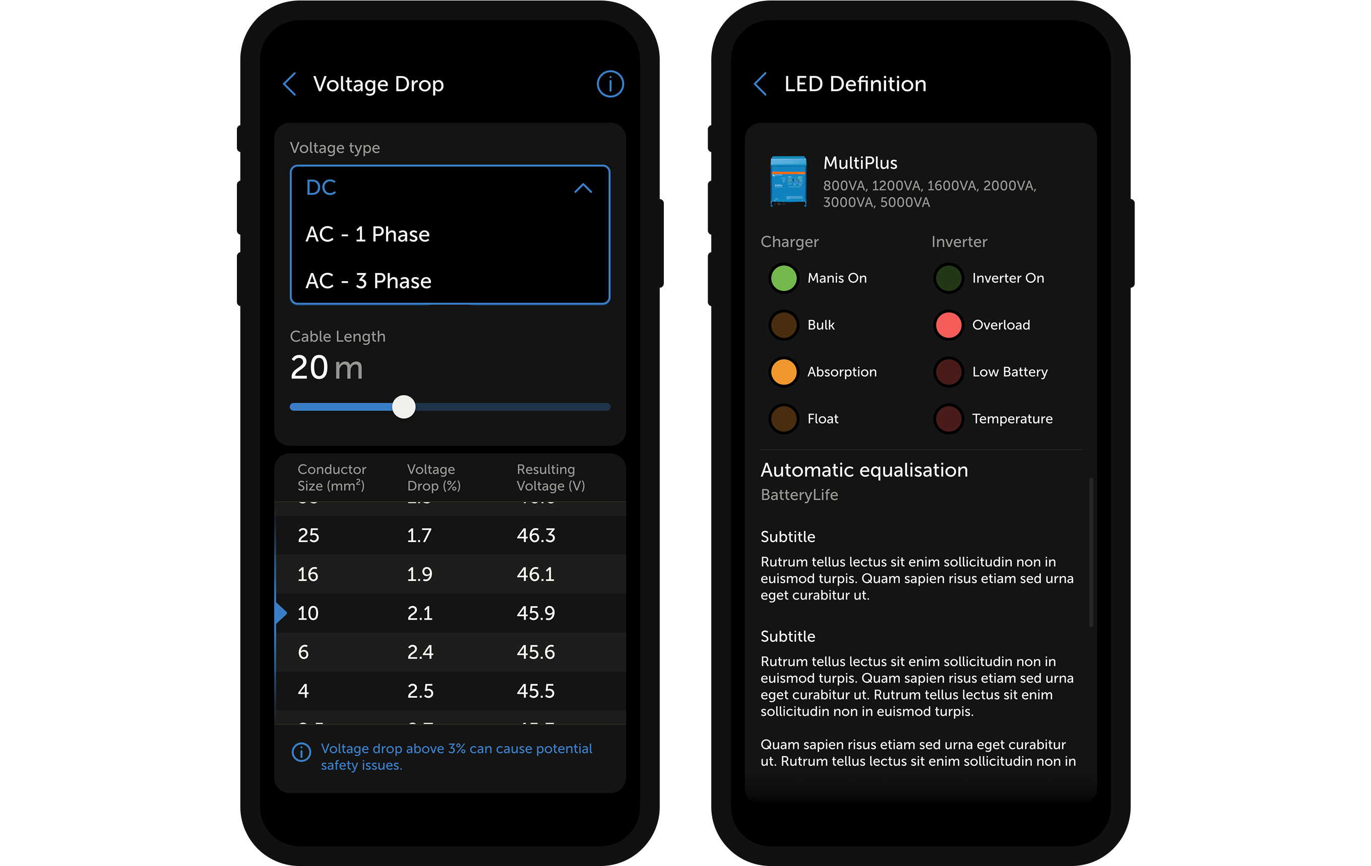
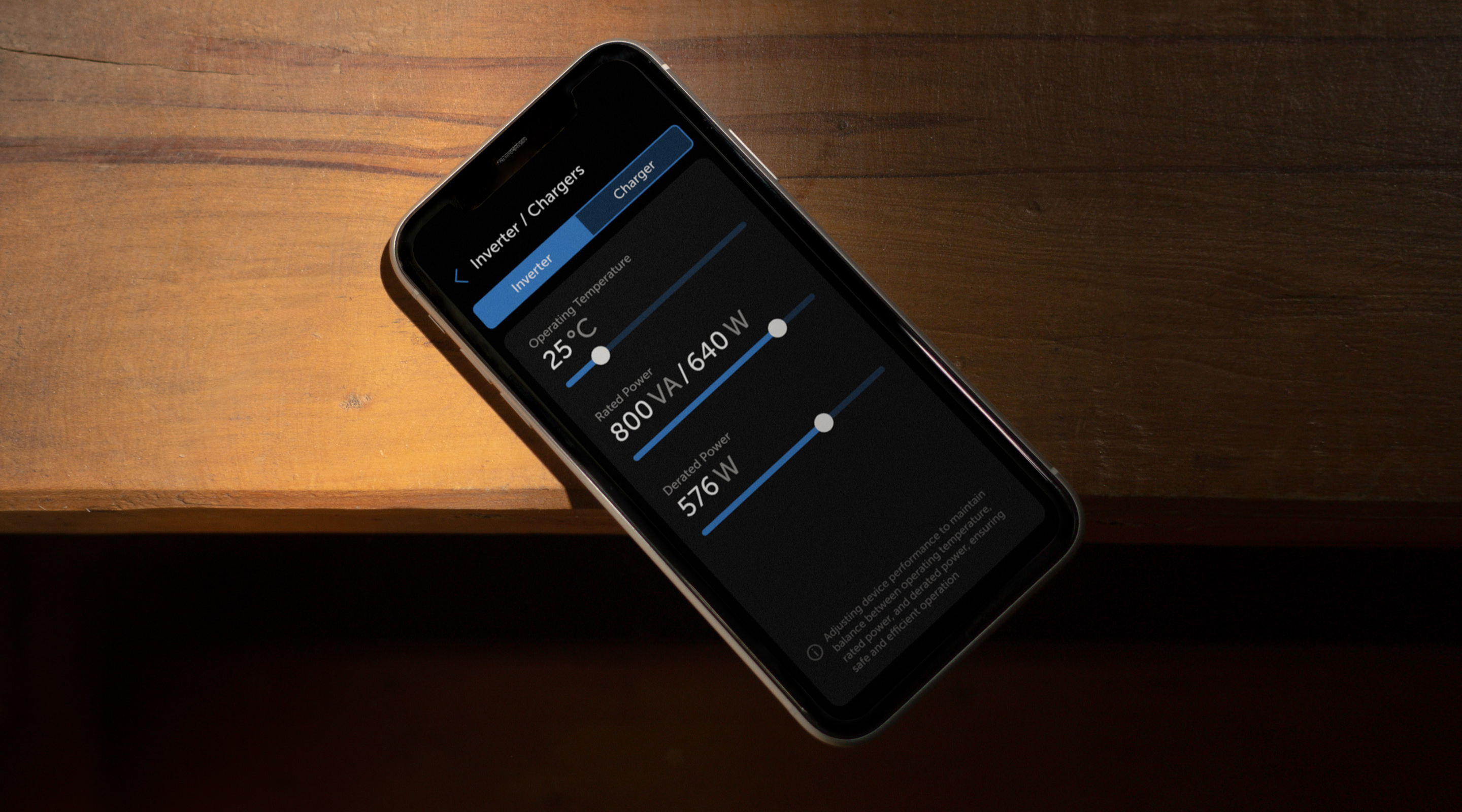
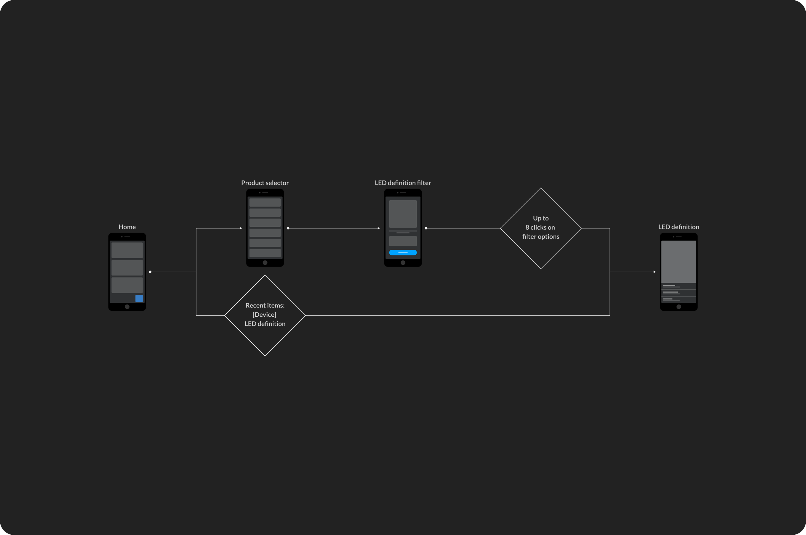
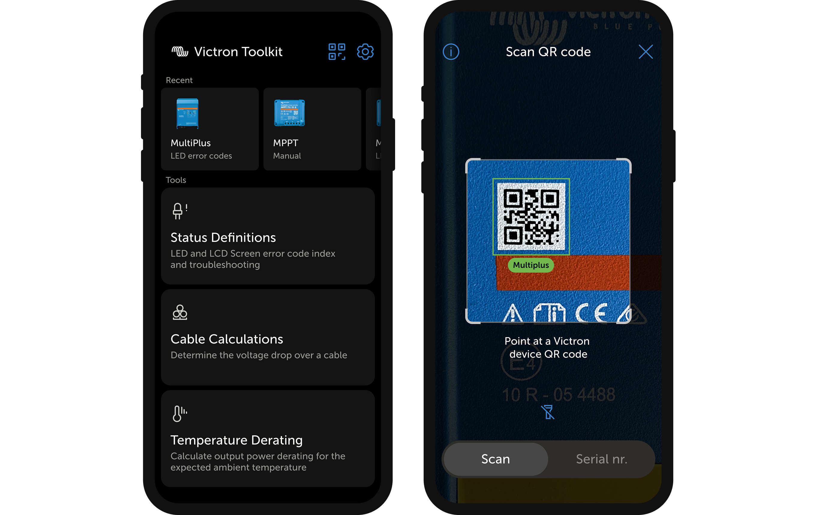
Victron Energy makes hardware and software for professional energy systems: marine, off-grid and industrial. Products are built for demanding conditions and known for reliability. When something goes wrong during setup, this app is what an installer reaches for.

Project + challenge

Two audiences, one interface, no existing design system and a tight deadline. We designed the app and built the design system simultaneously.

Victron installer imagery from the case study.

Understanding the users

Professional installers work on-site, in tight or dirty conditions, often under deadline. Amateurs need the same information but without the cognitive load. Designing for both meant balancing depth with clarity in a single interface.

Victron user needs and field context cards.

From insights to design directions

On-site use in difficult conditions led to large tap targets, high-contrast typography and dark mode as default. The different user types led to layered information: simple on top, technical detail one tap deeper.

Victron design direction and app interface.

Starting with user flows

Before any visual design, complete user flows were mapped to ensure no dead ends and no missing steps. These flows became the shared blueprint for structure, logic and developer handoff.

Victron user flows mapped before visual design.

Layered information approach

A dual-layer system was introduced to serve both user types. Essential information on the surface. Detailed technical data sits one tap deeper. Neither group is overwhelmed or under-served.

Victron layered information app screens.

Component-based design

The interface was built using reusable components. This ensured consistency across the app, supported a smooth developer handoff and made the product easier to extend over time.

Victron component-based app design.

Usability first

Clarity above everything else. Large tap targets, clear output values, and legible typography. All designed to work in low light, dirty gloves and time pressure. Prototypes were stress-tested in real-world conditions to validate readability.

Victron usability-first interface detail.
Victron flow and interaction shortcuts.

Navigational shortcuts

User flow analysis identified opportunities to reduce navigational steps. Shortcuts were added to reduce the number of taps to reach key actions and categories.

Victron final shortcut and scanner app screens.

Reducing interaction cost

Recent items and a QR code scanner reduced the steps to reach key actions by up to 10. This saved precious time during the process for installers.

Results

Deadline met

Fast process and user involvement from day one. From flowcharts to wireframes to final design: without losing quality.

-75%

Reduced troubleshooting time

Troubleshooting time reduced. The new LED definition filter replaced scanning through long lists, the most time-consuming part of the old approach.

Improved stability

Where the previous app suffered frequent crashes, the beta version is highly stable. This directly supported Victron's reputation for reliability.