
Client + context
Takeaway.com recruits couriers across multiple countries. The recruitment website is the main entry point, but it was built on assumptions, not insight.

Website
Improving courier recruitment through user research
Takeaway.com recruits couriers across multiple countries. The recruitment website is the main entry point, but it was built on assumptions, not insight.
The existing flow performed reasonably but nobody knew why candidates dropped off or what actually motivated them to apply. The challenge: find out, then redesign around real behaviour, while satisfying legal, marketing and business constraints.
I ran the user interviews and testing that reframed the project. During the project I kept recruitment, legal and marketing aligned and redesigned the landing experience and application flow to lift conversion and candidate quality.
The streamlined flow reduced completion time by 13%. Faster to finish, less drop-off.
A salary slider in the header let candidates calculate their earnings instantly. Web conversion went up 40%.

Involving couriers and stakeholders throughout the project meant insights were integrated early, not retrofitted. Better outcomes, less rework.
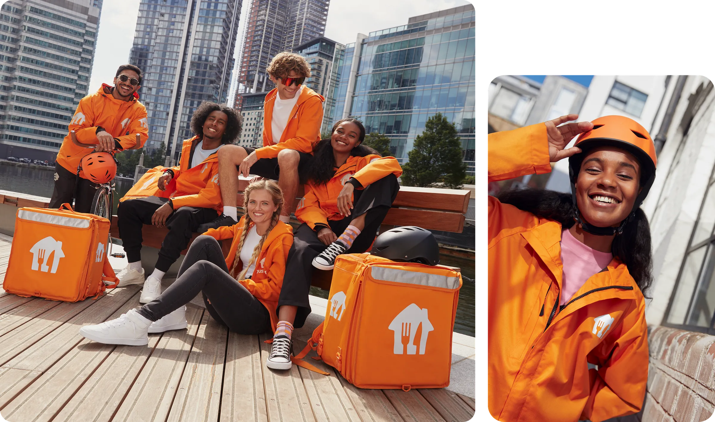
Takeaway assumed couriers were drawn to the outdoor nature of the job. Users told a different story: salary was the primary motivator, by a wide margin. This insight shifted the entire project direction. Salary needed to be upfront, not buried.
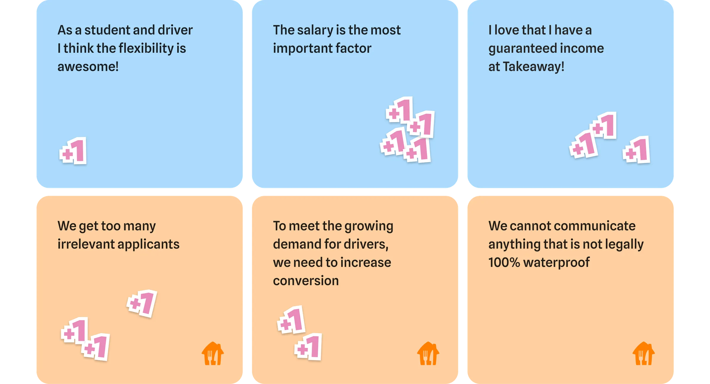
Mapping what couriers wanted against what the business needed revealed constant tension. Candidates wanted salary clarity. The business needed volume and quality. Legal set hard limits on what could be said. These conflicts became the blueprint for every design decision.
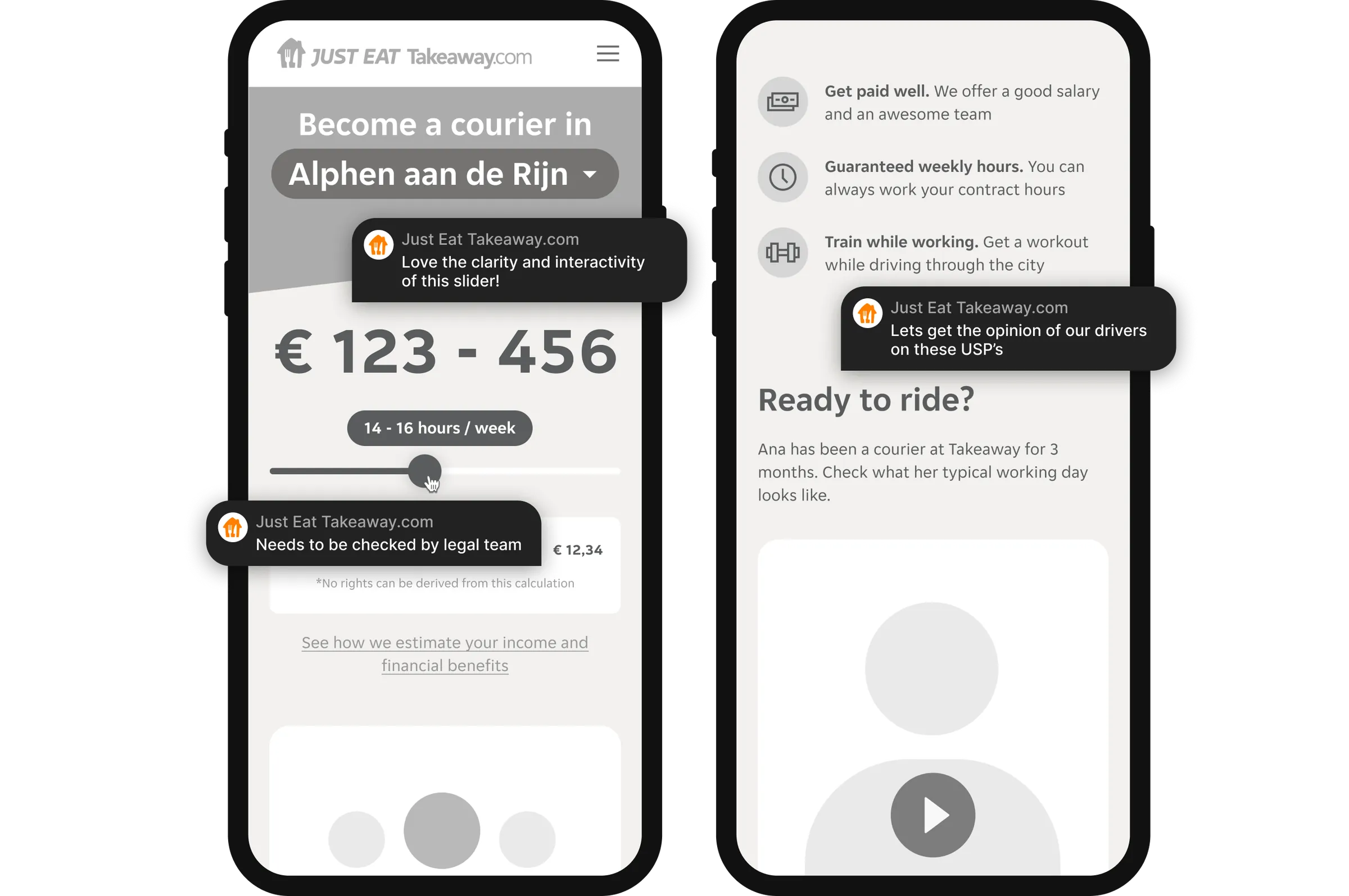
Wireframes gave all stakeholders a shared picture early, keeping focus on content and flow rather than visual detail. Reviewed and refined with recruitment, legal, marketing and target audience representatives.
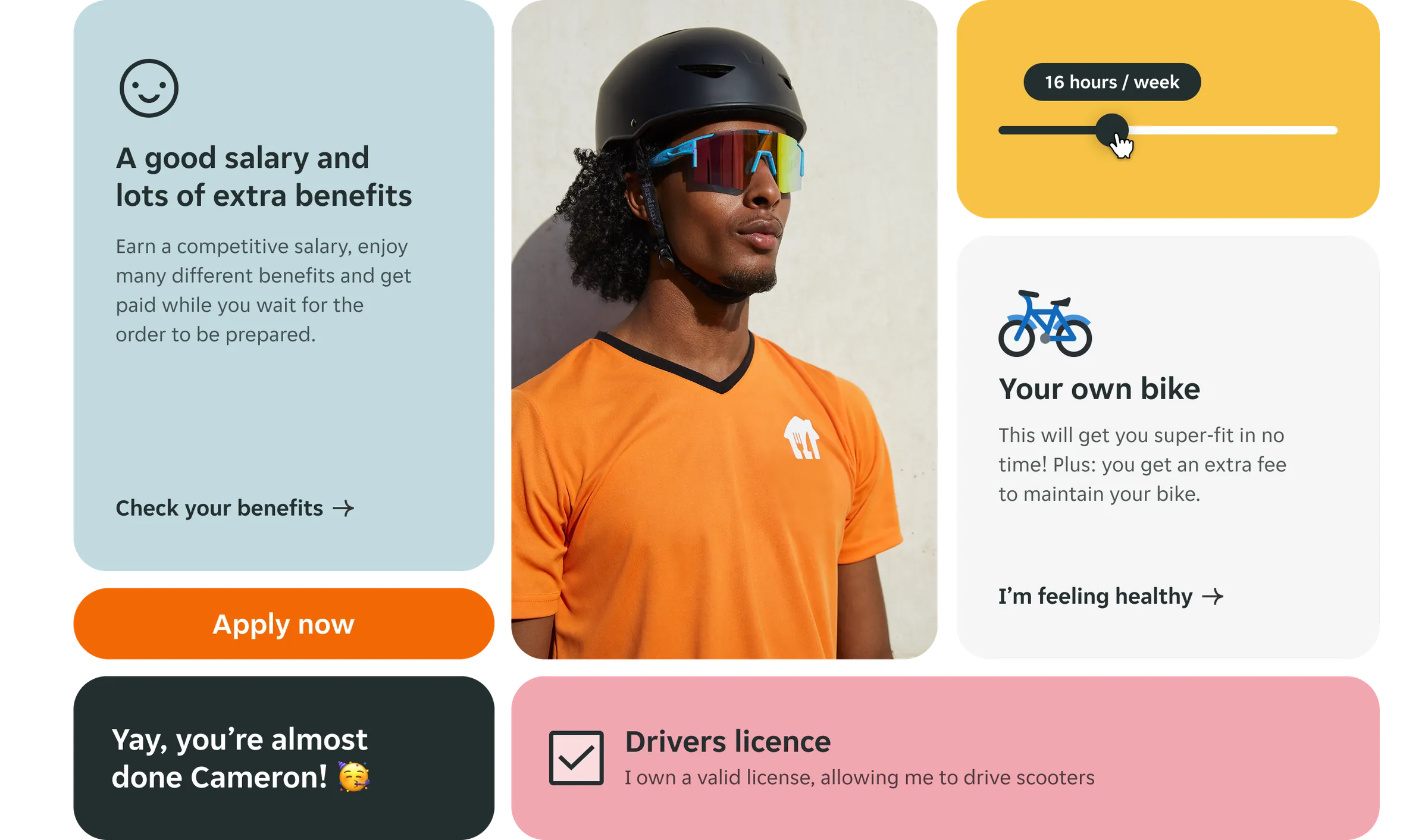
Components were designed to serve as reusable building blocks across the site. Each one was A/B tested for performance, keeping a close eye on site speed and technical constraints.
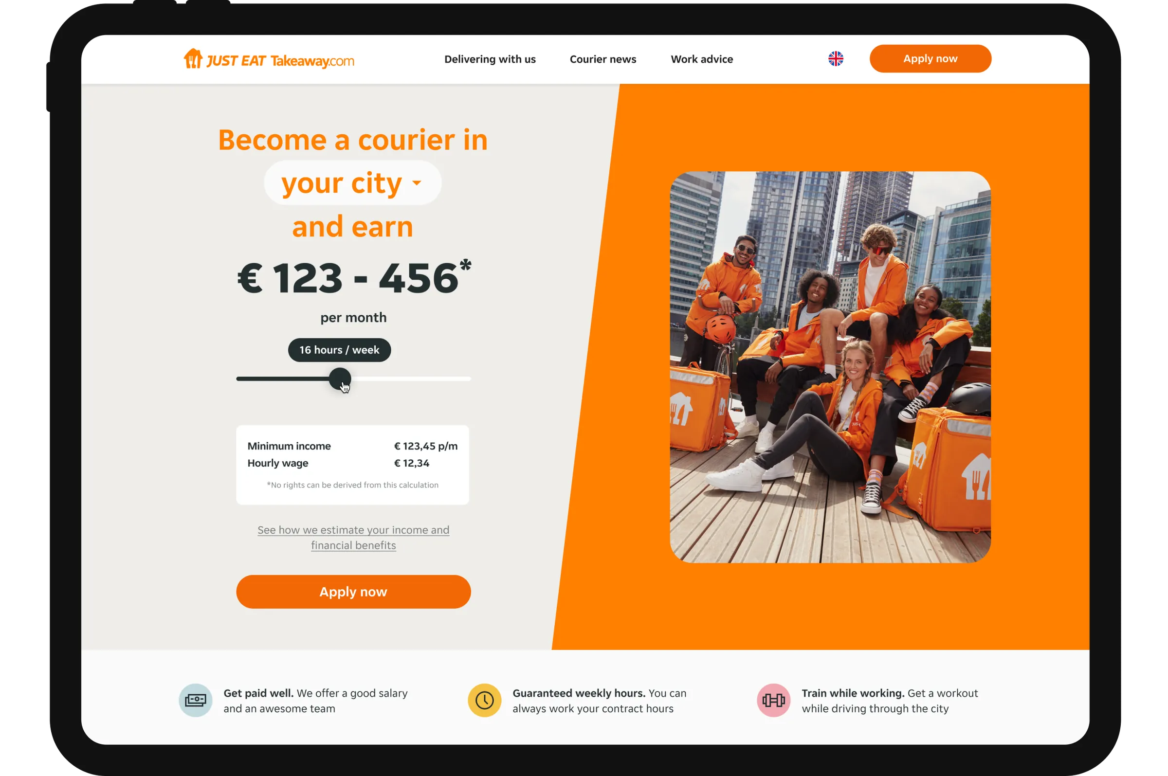
The new design was introduced section by section, country by country. This let us test and validate changes incrementally instead of shipping everything at once.
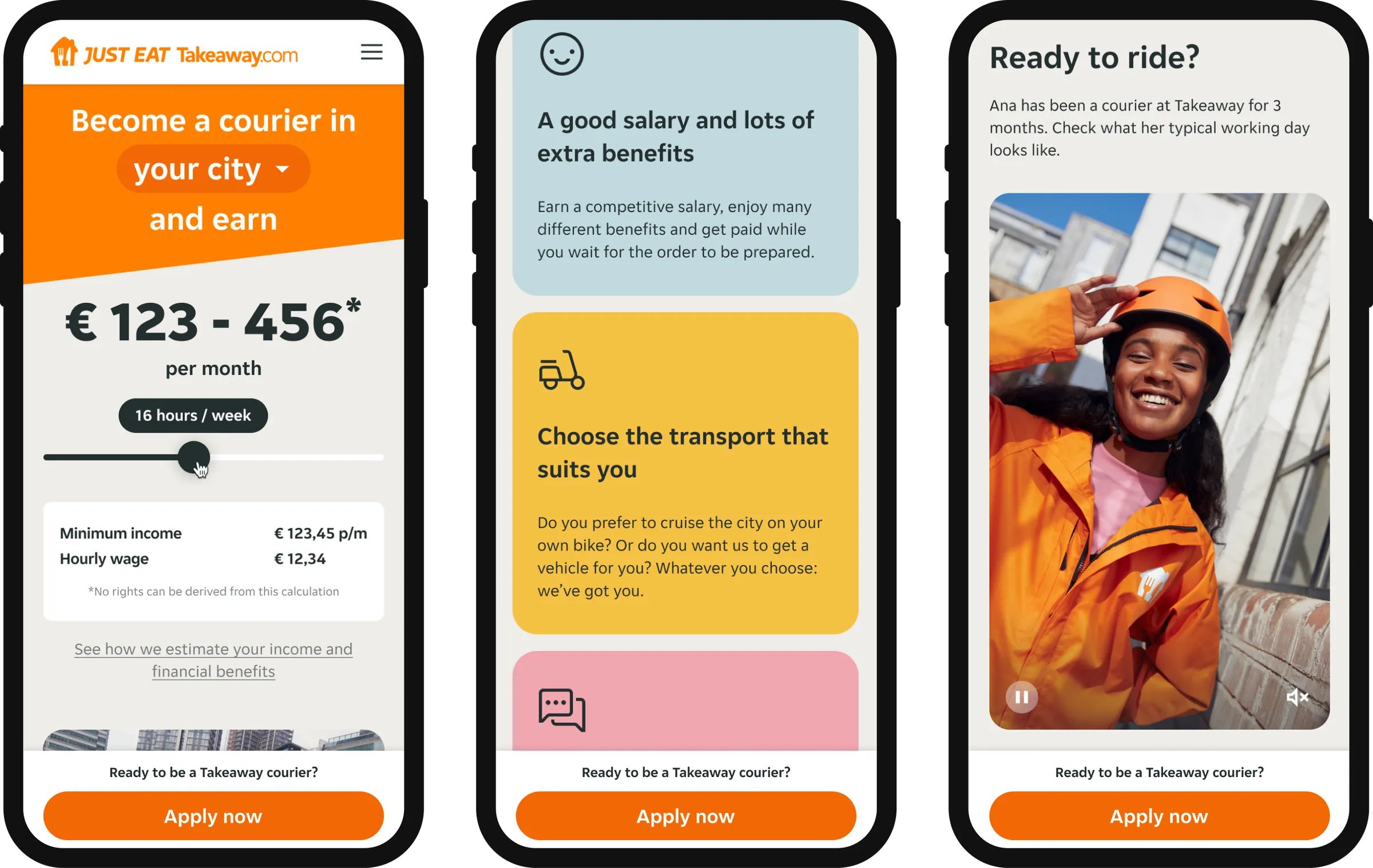
Around 80% of visitors came from mobile. Responsive was not enough. The experience needed to be built mobile-first, for the real context of a courier candidate on their phone.
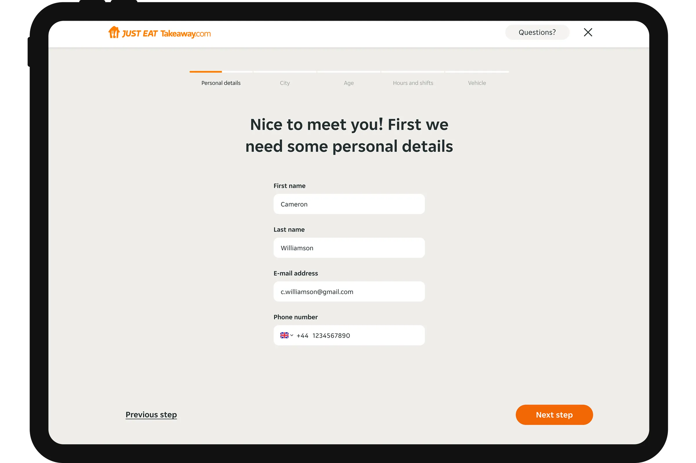
The flow went from 12 steps to 5. Less drop-off, higher quality candidates, fewer unnecessary barriers.
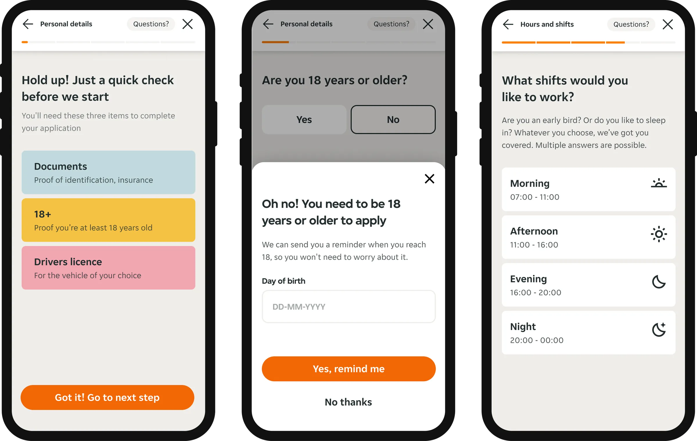
High conversion was not the only goal. Questions were introduced early to filter out unsuitable applicants, increasing both hire rate and candidate quality.